recently wrote about ems; what they are, how they're used and some bits and pieces to bear in mind when you implement them yourself. I only scratched the surface though, and the comments thread threw up twice as many questions as the article answered! In this follow-up I'll take things further, looking at ems in even more detail. E on DribbbleNote: The previous article covers all the basics. I recommend you read up on them before going any further.
Unitless Measurement Values
The subject of unitless measurements (ie: values without pixels, percentages, ems, yards, fathoms..) was offered up by a coupleof people last time, especially as I'd encouraged the use of ems for specifying line-height. Ems make perfect sense in this case as they're relative to the font-size. If the text in question grows or shrinks, so too does the line-height if it's set in ems. Absolute units, like pixels, would really mess things up. The same is true of letter-spacing, another example of a dimension which should always be relative to the font-size. However, we can improve on this. Ems complicate things as their values cascade; elements inherit their parent's em values. Take this arrangement for example: an article which contains a paragraph: If we apply the line-height to the article, it will also be inherited by the paragraph, which is fine: But what the paragraph is actually inheriting is the computed value (in this case effectively 24px), so its line-height is relative to the article's font-size, not its own. If we increase the paragraph's font-size to the equivalent of 20px: then its line-height remains staunchly at 24px. Ideally, we'd like its line-height to appear 1.5 * 20 = 30px. This is where unitless measurements come in. By removing the em unit from the article's line-height: the paragraph will inherit the unitless value instead, 1.5. The paragraph's line-height is now relative to its own font-size, bingo! This pen should help you out.. Interestingly though, this doesn't apply to letter-spacing. And you can completely forget about margins, text-indent, that sort of thing. If you're interested in reading more on the topic Eric Meyer covered it solidly way back in 2006, plus Harry Roberts has a great overview of measurement units from a couple of years back.
Ems and Macrotypography
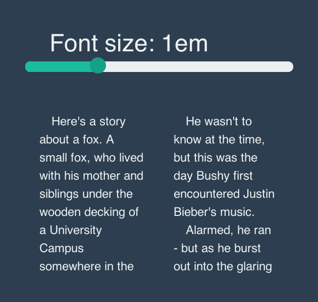
Whereas microtypography refers to the tiny details within a document (punctuation marks, ligatures, hyphenation, kerning and so on) macrotypography handles all the "big" stuff. Think about all the aspects of typography which make a body of text readable; whitespace, line length (measure), paragraph indentation etc. Take a look at this fluid column setup: A perfectly decent layout; two divs, each one precisely 50% wide, with some padding left and right to form the gutters (inside each div, assuming * { box-sizing: border-box } is being used). Typically, you'd be tempted to define the padding using pixels, or (even better) percentages, if you were feeling super flexible. However, pixels and percentages will both have a detrimental effect on the readability of the content, if (when) the font-size is altered. Gutter width, as with whitespace in general, should really be sized relative to the text. In this example, we have two columns of text, with guttering applied as a percentage of the column width, just like we described above:
1
2
3
4
5
.column {
width: 50%;
float: left;
padding: 03%;
}
This is a live demo, take a look and mess around with it yourself..When you alter the font-size however, you'll notice the gutter becomes relatively narrower, blurring the division between the columns of text and making it more difficult to read. This is an extreme example, with absurdly large text for the column width, but it illustrates the point..Far better would be to define the padding using ems:
1
2
3
4
5
.column {
width: 50%;
float: left;
padding: 01.2em;
}
This way, the gutter grows and shrinks along with the text, maintaining the distance between columns and keeping things readable. Try playing with this one..
The Ol' 62.5% Setup
If you aren't yet using ems, it's probably down to one of two things which you don't like about them; the fact that their values cascade, or having to calculate those values in the first place. The 62.5% approach (first proposed by Richard Rutter way back in 2004) will help you out on the second one. Quite simply, instead of setting the base font–size to 100% (which we’ll assume is 16px) we set it to 62.5%, effectively 10px. From that point, 1em = 10px. Therefore:
Ems
Equivalent pixels
0.5em
5px
…
…
1.1em
11px
1.2em
12px
1.3em
13px
1.4em
14px
…
…
47.3em
473px
and so on, which should remove some of the mental arithmetic. However, there is a small issue with this approach, and it all has to do with…
Em-based Media Queries
We'll talk a bit about the 62.5% caveat in a moment, but first we need to lay down some foundations. In their simplest form, media queries help us apply CSS rules under different circumstances, most commonly depending on screen size. Screen resolutions are measured in pixels, so it's only logical we define media queries in the same way:
1
2
3
@media only screenand (min–width: 600px) {
/*some stuff*/
}
Let's apply this to our previous demo, to split the columns up after a certain point. In this mobile first approach, our columns are split once the viewport reaches 600pxThe arbritrary figure of 600px just happens to be fine in this case; optimum line length (or measure) is a highly debated topic, but as Robert Brighurst states:
Anything from 45 to 75 characters is widely-regarded as a satisfactory length of line for a single-column page set in a serifed text face in a text size. The 66-character line (counting both letters and spaces) is widely regarded as ideal.
In our demo, at font-size of 1em, the measure now hits around 70 characters before splitting into two columns. Once we hit two columns, the measure is perhaps a little narrower than we'd ideally like, but these columns are perfectly okay for the purposes of this demo. However, problems arise when we alter our browser's font-size (hit command +). With font-size boosted to "Very Large" (I'm using Chrome) our column measures are way too narrow, making the content pretty unreadable. For this reason, we should consider making our media queries relative to font-size too. Remember the formula from our previous article? We're aiming for 600px, from an inherited font-size of 16px. 600/16 = 37.5em, so let's change our media query to reflect that: Now, when our browser's font size settings are altered, we see a difference in the way the media query behaves. With larger text, here's the pixel-based media query, with the viewport set at around 630px wide: Whereas, at that screen width, the em-based media query keeps things neatly in one column; nice and readable. Zoom in/out and watch the media query take effect
Back to That 62.5% Thing
Here's the crunch; em-based media queries are totally disinterested in any sizing on the html, body, or whatever; they're relative to the browser's font-size. This means that, by setting the base font-size to anything other than 100%, you'll have to manage two scales of em values. Work from a base of 100% and everything will begin from a level playing field. Besides, as Filament Group argue, working in this way moves you away from thinking in pixels, which is a good thing.
Ems, Rems, Functions and Mixins
One word came up more than any other in the comments thread of the previous article; mixin. If you're struggling to get your head around the calculations, then why not let a CSS preprocessor do the heavy lifting for you? With CSS preprocessors, such as Sass, LESS and Stylus, you can define mixins and functions. These accept parameters, then calculate and churn out CSS values for you. Note: If you're new to the concept, take a look at Mastering Sass: Lesson 2 in which Jeffrey introduces Sass mixins. Mixins and functions can handle all kinds of things for you, including the troublesome mathmatics surrounding ems. Take this simple example from Garrett Winder at Erskine. He starts out defining a function (called "em") which accepts two values (just as our formula from earlier) though the context value has a default of 16, so it needn't be specified again unless necessary. We can then use that "em" function within CSS thereafter, asking it to calculate the equivalent of 30px: Which, when compiled, outputs the CSS in its raw form: And this isn't the only example of its type either - thousands of front end developers have cut their preprocessing teeth by writing their own em mixins. Rems too; by inputting the desired pixel value in this mixin featured by Chris Coyier, you can just as easily have rems outputted, with fallback pixels. Here's the mixin.Here's the usage.Here's the result.The list is almost endless, but if you have any mixins you like to use in your own work (for outputting ems and rems) let me know in the comments and I'll add them here:
It's a broad subject, there's clearly loads to take in, but diving into the world of ems is one of the more satisfying challenges in front-end web development. Stop thinking pixels and start thinking relatively, today!


No comments:
Post a Comment